
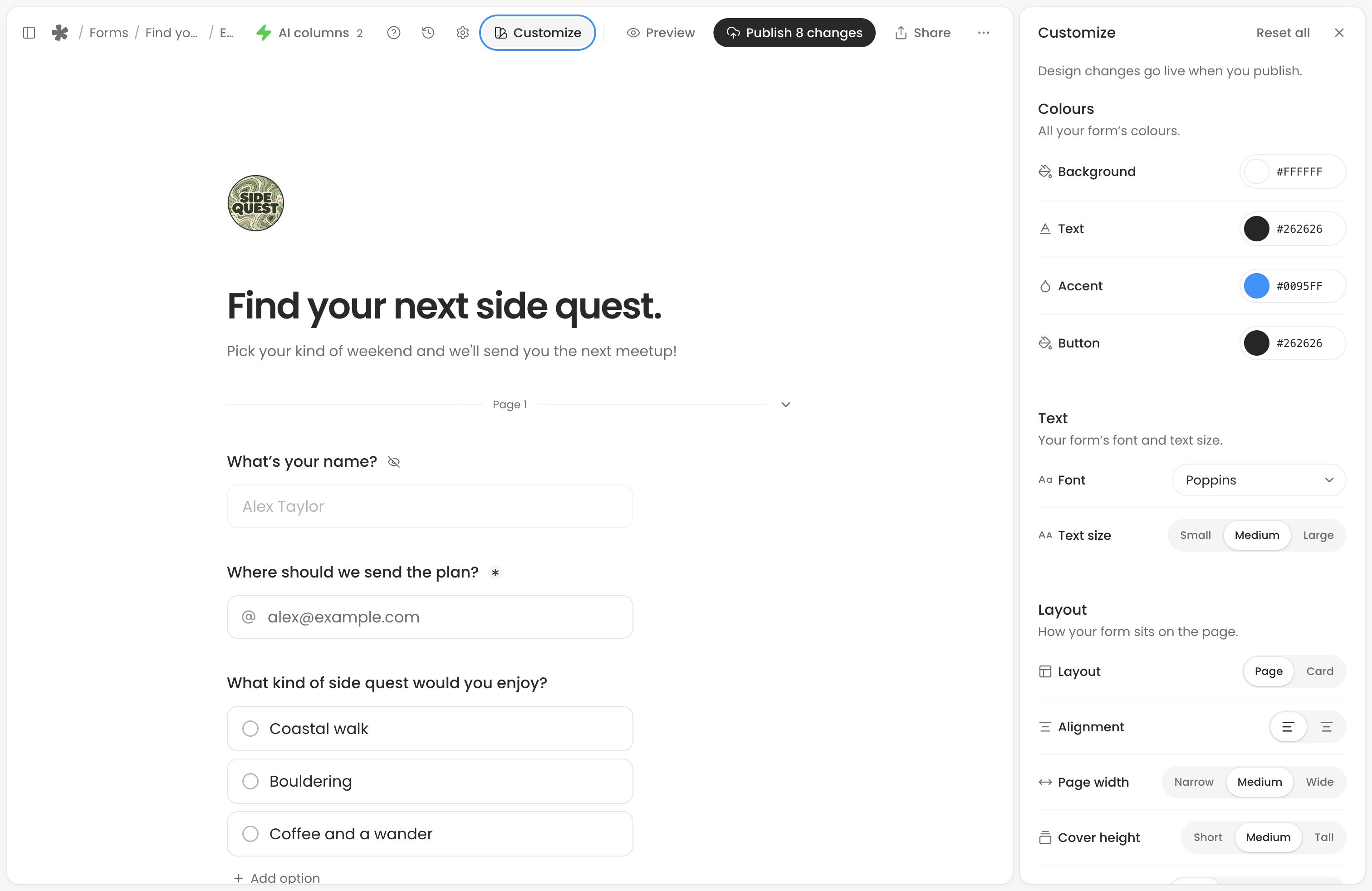
Open the form from Forms (opens in a new tab), then choose Edit form and Customize. Form colours, fonts, logo and images are available on Free and Creator.
Make the form recognisable
Choose a background, text and accent colour that suit your brand. Keep text readable against the background and card colour; the editor flags combinations that may be hard to read.
Customize groups the controls by their purpose:
- Colours: background, text, accent and button colours, with extra card colours for a card layout.
- Text: font and text size.
- Layout: card or plain layout, alignment, page width and header proportions.
- Inputs: field style, size, width, corners and spacing.
- Buttons: size, width, alignment and corners.
Use the logo and cover controls at the top of the editor to add an image or choose built-in artwork. Customize also controls logo size and shape, and cover height.
Edit the form’s title and introductory text alongside your questions. Add social links in the header when they help people recognise you.
Check desktop and phone layouts
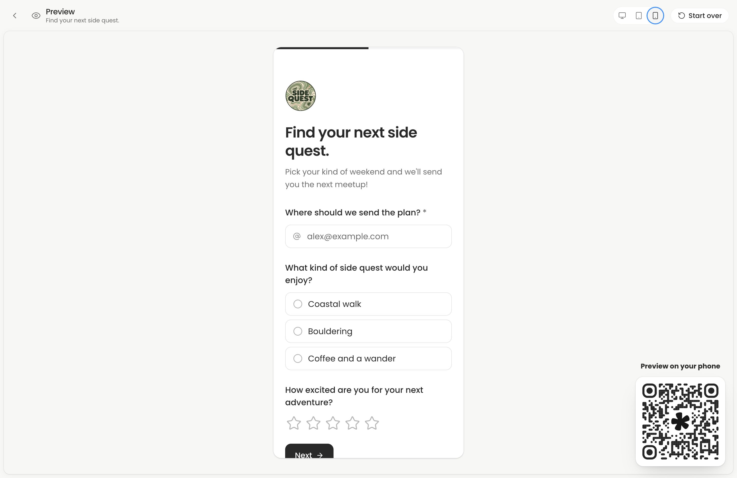
Open Preview and try the form’s pages. Check that headings, descriptions and buttons remain readable on a phone. Keep the opening focused so people can reach the first question easily.
Publish the design
When you’re ready, publish your changes. Open the live link on a real phone to check the result. Existing embeds pick up the published design too.
For custom addresses, link previews and QR codes, follow Share your form. Branding removal is in Form settings.
Next action: Publish your design changes, then open the live link to check them.