
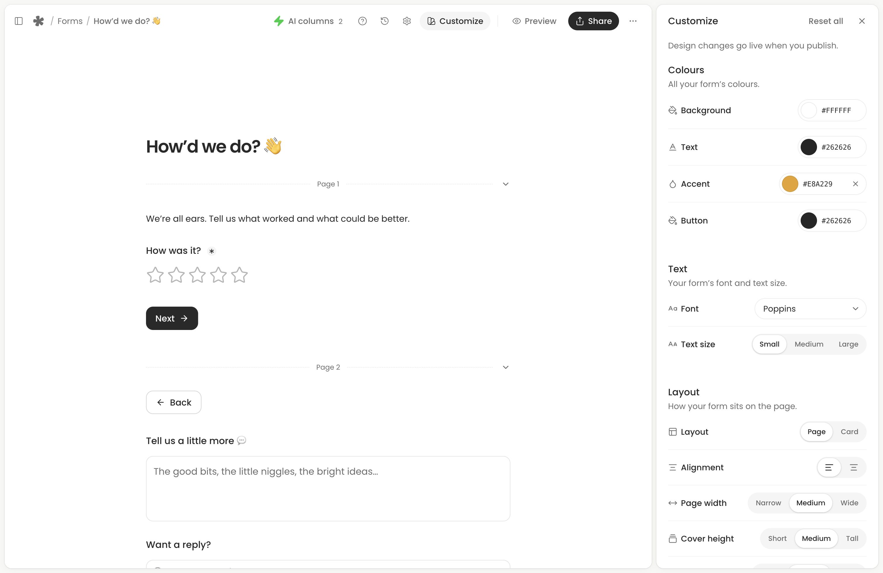
Open the form from Forms (opens in a new tab), then choose Edit and Customize. Form colours, fonts, logo and images are available on Free and Creator.
Make the form recognisable
Start with a background, text and accent colour that suit your brand. Keep text readable against the background and card colour; the editor flags combinations that may be hard to read.
Customize groups the controls by their purpose:
- Colours: background, text, accent and button colours, with extra card colours for a card layout.
- Text: font and text size.
- Layout: card or plain layout, alignment, page width and header proportions.
- Inputs: field style, size, width, corners and spacing.
- Buttons: size, width, alignment and corners.
Use the logo and cover controls at the top of the document to add an image or choose built-in artwork. Add social links in the header when they help people recognise you. Customize also controls logo size and shape, and cover height.
The form’s title and introductory text belong to the main document. Edit them alongside your questions.
Check desktop and phone layouts
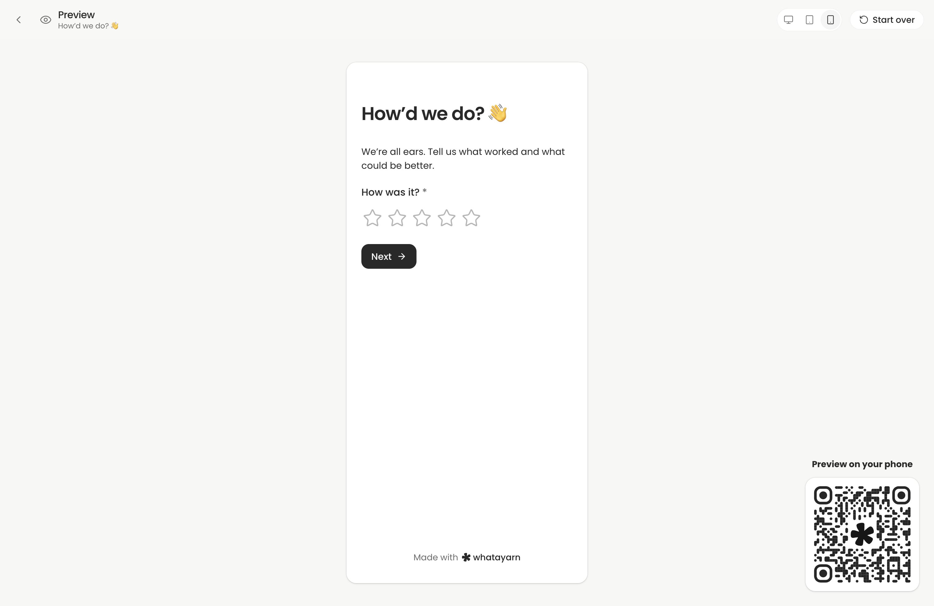
Use Preview to try the form and its different pages. Check that headings, question descriptions and button labels remain readable on a phone. Long introductions or large covers can push the first question down, so keep the opening focused.
Preview shows your editing work without collecting a response. After publishing, open the public link from Share to check the actual respondent experience.
Publish the design
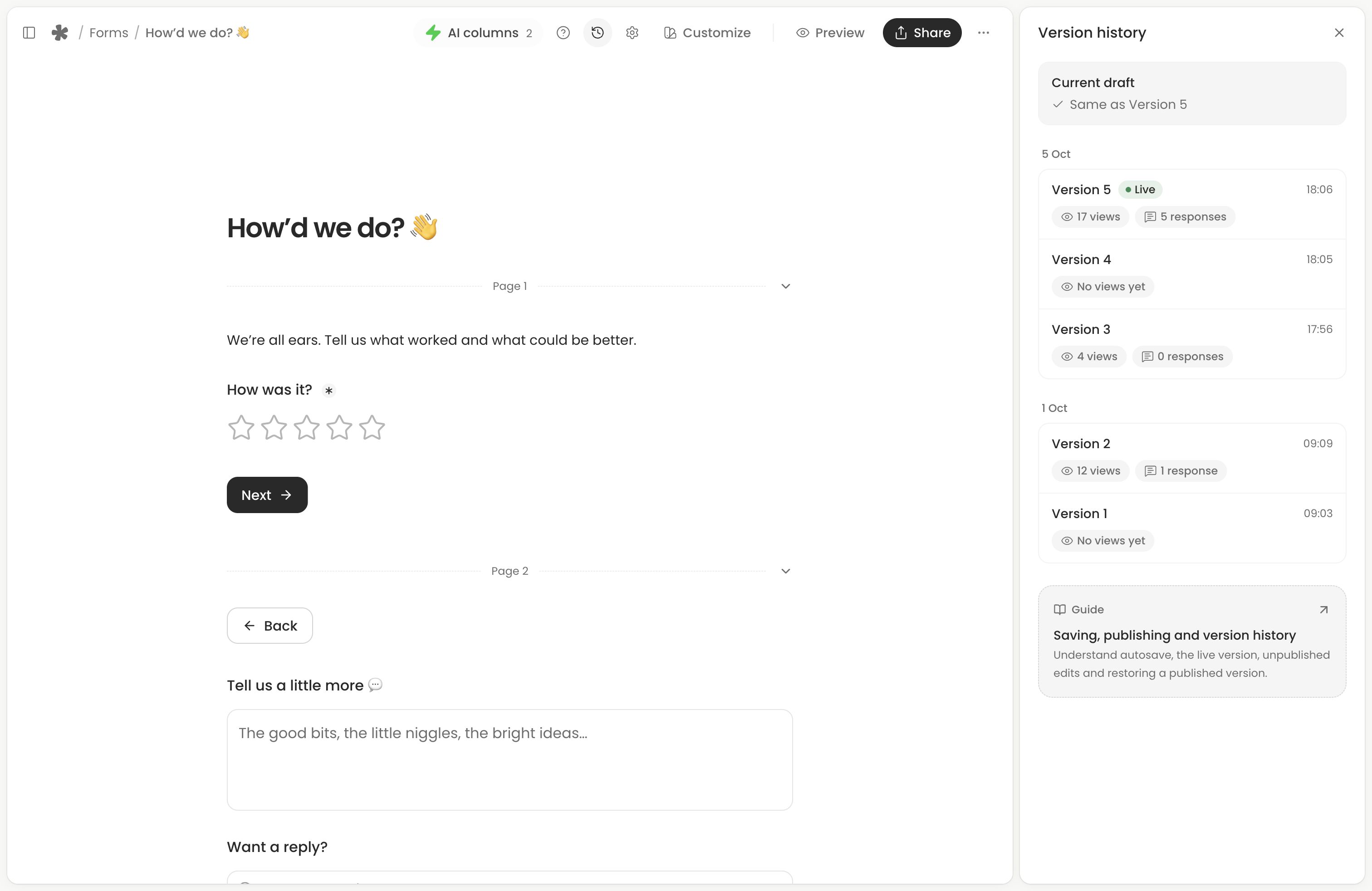
Edits save privately after the initial live version. Select Publish changes when you want respondents to see your updated design. Opening Share saves pending work without publishing it. Existing embeds pick up the published design too. See Saving, publishing and version history.
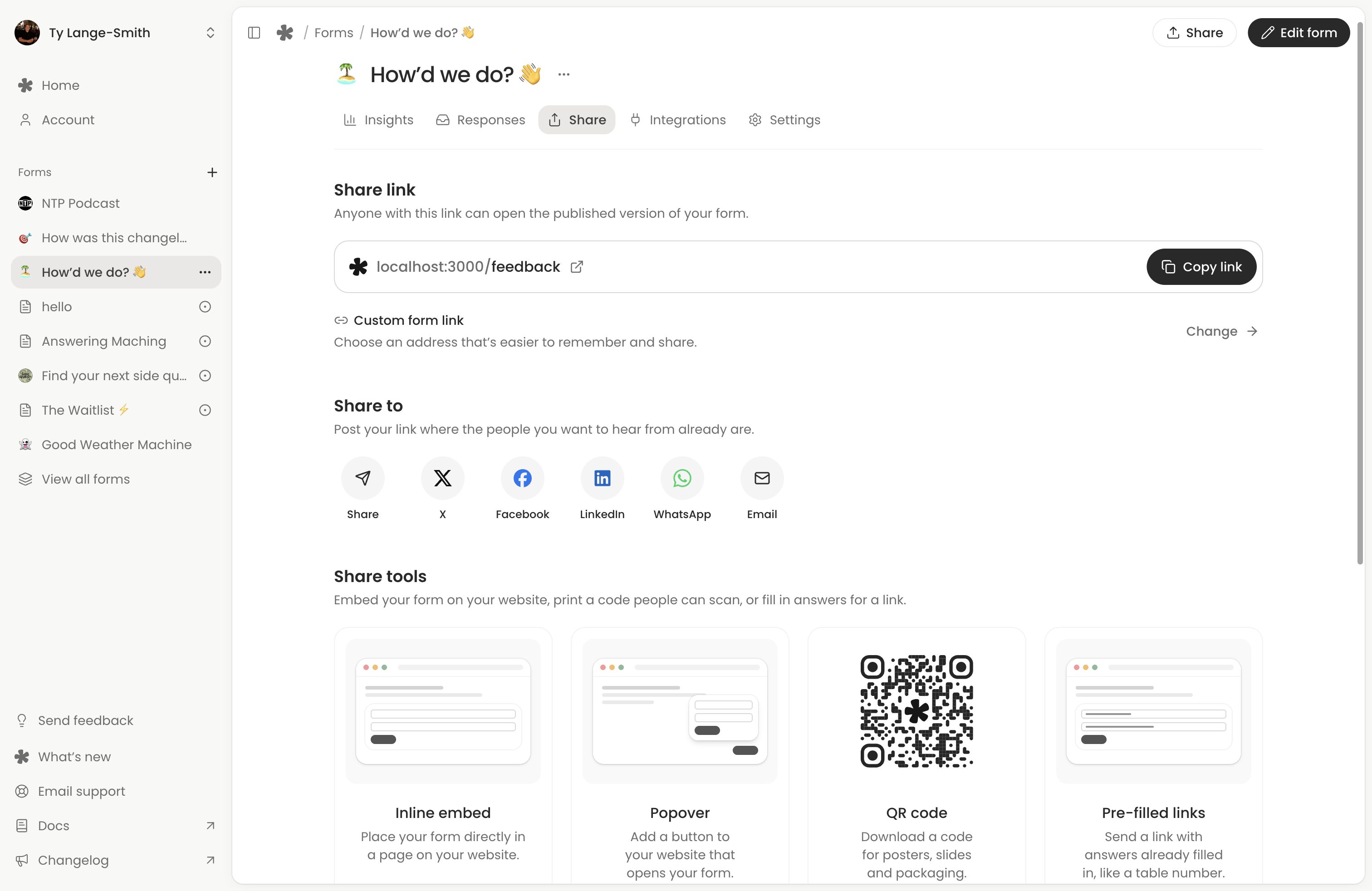
Choose a custom form link
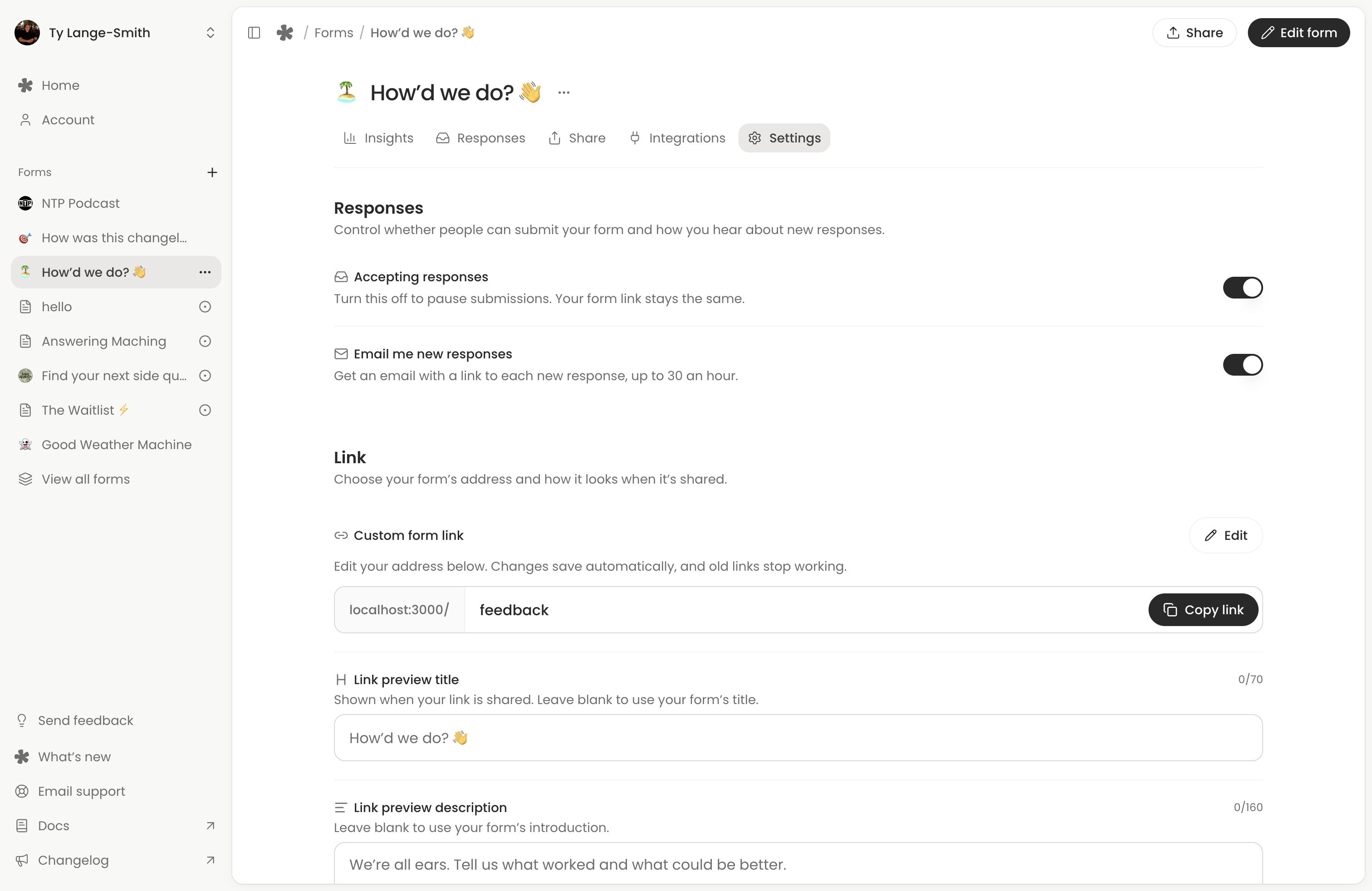
Open the form’s Share section and choose Change beside Custom form link, or open Settings directly. The generated link works on Free; Creator lets you choose how the link ends. Enter an available address, leave the field or press Enter, and wait for the save confirmation.
Changing the title does not change the public address. A custom address changes immediately when saved, without publishing. Its previous custom address stops working.
After changing a link
Copy the current address from Share and test it in another tab. Replace links and QR codes that used the previous custom address. Generated inline and popover embeds use the form’s stable ID and keep working; you only need to change installation code if you manually used the previous custom address in it.
Link previews and branding
Use Link preview title and Link preview description in Settings to choose the text shown when you share a link. Both plans include these controls, and the text applies as soon as it saves. The preview image uses the form’s published logo and cover.
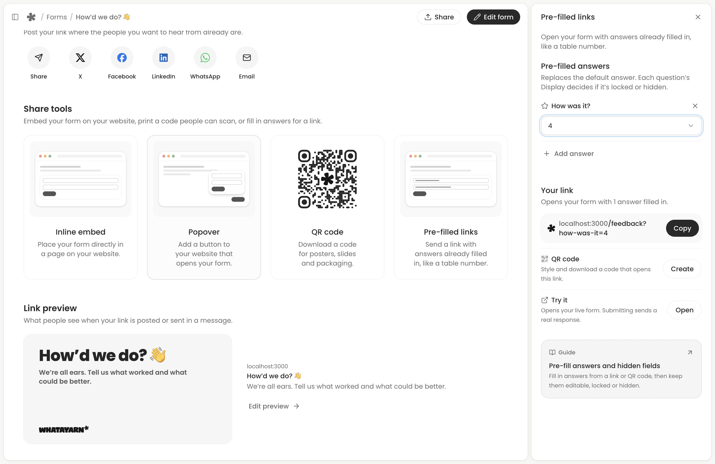
Creator can remove the whatayarn mark from the form and use a custom QR code with your logo and colours. These are separate from the form’s design: see Manage form settings and Share your form.
Next action: Publish your design changes, then open the live link to check them.